Malmö is known to be very beautiful in June. At least that’s what i’ve heard from the Bitcraze team when we talked about having a meet-n-geek in their offices in Sweden.
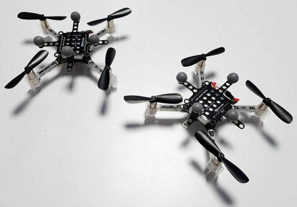
I’ve been working on the crazyflies and developing artist friendly interface to control them for a year now, and I always was impressed with their philosophy of work and communication. Over the past year, they’ve helped me and my companies a lot to be able to create the shows we want, with our specific needs and constraints, that researchers don’t have, like fast installation time, or confidence in drone take off (you want to make sure that a drone won’t hit the theater’s director’s head at the very beginning of the show !).

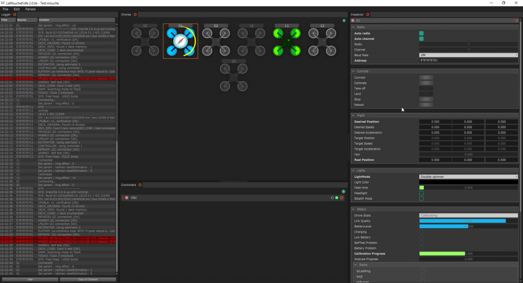
For that I created LaMoucheFolle, which is an open-source software with a nice UI to be able to connect, monitor and control multiple drones. LaMoucheFolle is not made to be a flight controller, but acts more as a server that any software will be able to use, like Unity or Chataigne. That way, people and users don’t need to handle all the connection, feedback, warning, calibration process and can concentrate essentially on the flight and interaction.
While the fist version of LaMoucheFolle got me through most of the demos and workshops, I knew that it could be vastly improved if I understood better the drones, so I decided to ask the creators to meet them, and here I am !
As I hoped, being physically there allowed me to understand better what are their practices, and allowed them to better understand mine, so we could find a way to improve both their Crazyflie ecosystem and my contribution to it.
So I refactored, redesigned and improved LaMoucheFolle to a (soon to be released) V2, featuring :
– New drone manager interface with a more intuitive feedback of the drones
– New multi-threaded drone communication mechanism
– New state-safe sequenced initialization and flight control of the drone, with a progressive take-off vastly increasing its stability
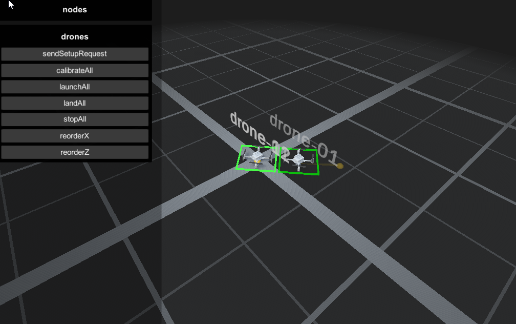
– Unity demo app and Chataigne demo session to show how to control from other softwares via OSC

While developping the new version and talking to the team, some key features and improvements for the use Crazyflies in shows were discussed and some of them are now in research/development :
– Health analysis : using the accelerometer’s data and Tobias’ magic brain, it allows to test the motors while the drone is on ground and find out if one or more are problematic (too much or not enough vibration, meaning either the propeller or the motor needs to be repaired/replaced)
– Battery analysis : when the battery is fully charged, this allows to have an automated motor sequence which will find out if the battery has an abnormal discharge behavior
– Steath mode : Shut down all the system leds (the 4 builtin leds on the drone) so it can be invisible, ninja-style
– Normalized battery level and low battery log values : it allows for safe and consistent feedback of the battery level in percent, and an indicator if the drone should land soon. It will also possible to use this value to monitor the charging progression of a drone.
– LedRing fade pattern : This mode allows for easy fading between solid colors on the led ring, so it’s not necessary to stream all the colors from one color to another, but instead having a very beautiful smooth interpolation, using only 2 parameters : the target color and the fade time.
I hope you are as excited as I am about those new features, and if you’re not, please tell us what would make you “vibrate” !
I’ve been spending the last week at their office, and it was a great week : I initially came to improve my software, and discuss about future development of the Crazyflies [which was great], but what i’ll remember the most from this trip is by far the human aspect of the Bitcraze team.
Marcus, Kristoffer, Tobias, Björn and Arnaud are amazing and i’m really happy to have had the chance to see them working, and collaborate with them. I admire their choices of being fully transparent on their work and amongst themselves, and there is a natural kindness mixed to the passion for their project that makes working there feel like everyday’s special. Also, Malmö is very beautiful indeed :)
Thank you very much and I hope to reiterate the experience soon,
Skål
